Bathhouse caldarium & Soapery rebrand
Their Story
BathHouse was created by Charlene Simon. It’s a boutique soap and bath goods shop that specializes in natural ingredients and sophistication. BathHouse now has 4 brick and mortar locations (including one in Memphis) as well as an online market. Simon wanted her customers to feel exclusive, extravagant and just a little pretentious. But the old branding is falling short of that goal.




New logo
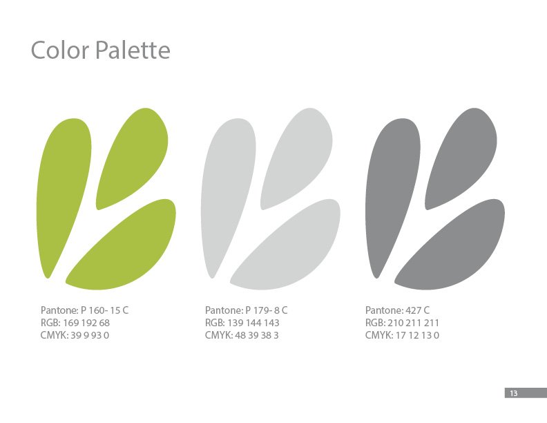
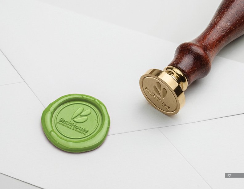
The new BathHouse logomark features three leaves or buds that serve to connect the BathHouse brand with the natural ingredients that make up their products. The buds also mimic the ligatures of the capitalized letter “B” but should not stand alone until BathHouse is an established household brand recognizable by the mark alone.
touchpoints
I thought about expansion for Bathhouse, The company sells bath and body products, why not expand into luxury towels to offer customers a more complete experience?
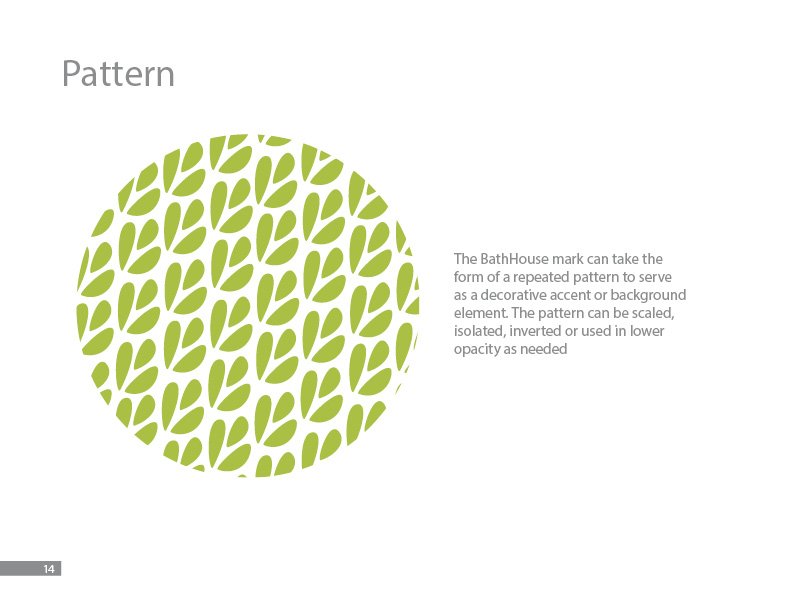
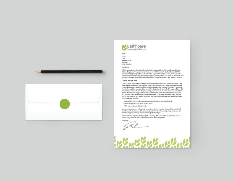
The Bathhouse B logomark becomes a pattern to be used as a design element on collateral for the business.
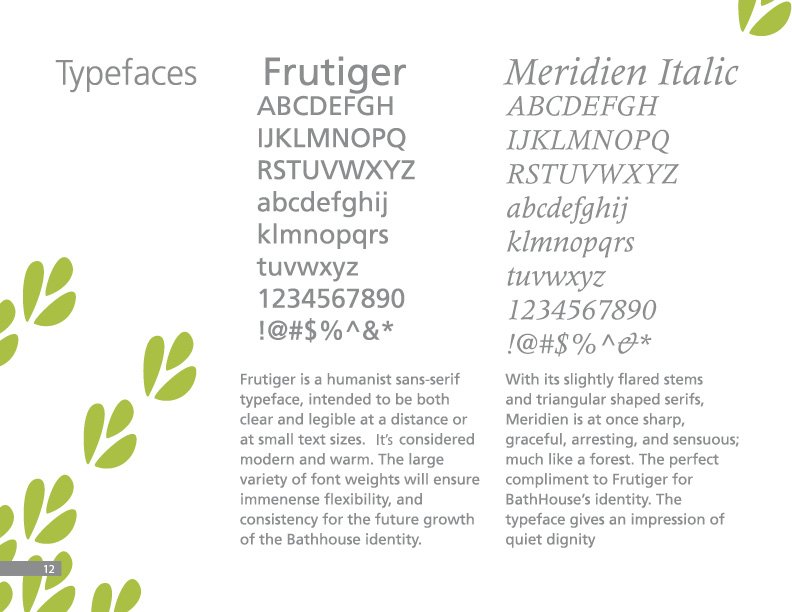
The Bathhouse logo looks clean and natural further communicating the natural ingredients of their products.


